fresh ink
Poster designs and other assets for Fresh Ink Theatre Company. Fresh Ink is a Boston-area theatre company committed to producing inclusive and innovative new work. Their branding is fairly loose, and because of that I have the opportunity to really be creative with these posters and tailor each design to the plays themselves.
WHEN?
WHAT?
SEPT. 2023 - PRESENT
THEATRICAL POSTER DESIGN
honey girl

Honey Girl was the first poster I ever created for Fresh Ink. It’s a very emotional piece with a lot of heart and personality, and although it is about loss, it’s also about the about love that exists within and after loss. The main character, Fey, has just lost her sister Asal, and is also grappling with the idea of memories becoming reality. I liked the idea of representing Asal’s memory in a way that felt hazy and half-real, but most importantly as a warm and loving entity. I wanted to reflect the intimacy of the script in the visuals of the poster, and, on top of the color palette, kept the typeface sketchy, round, and all lowercase for this reason.


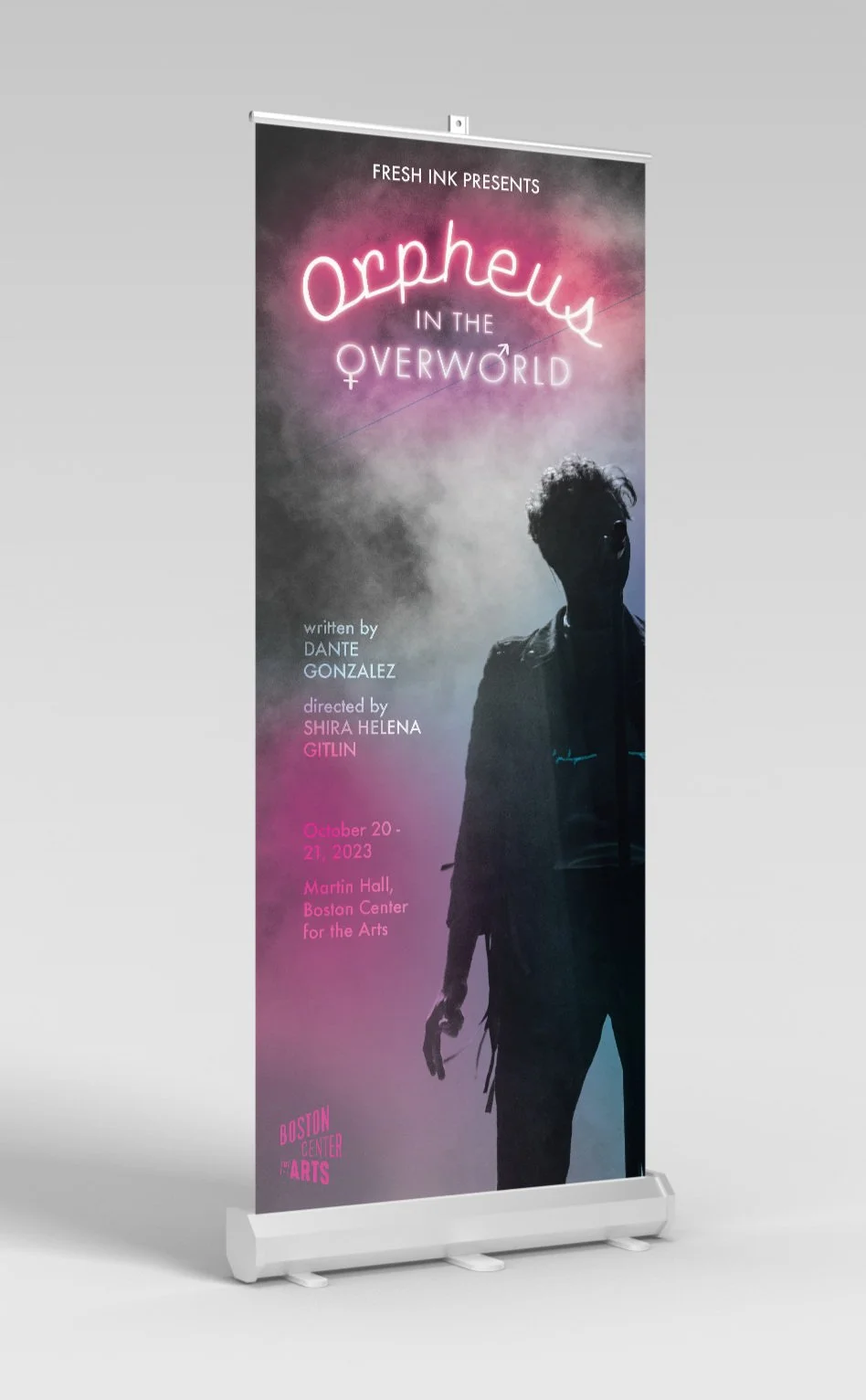
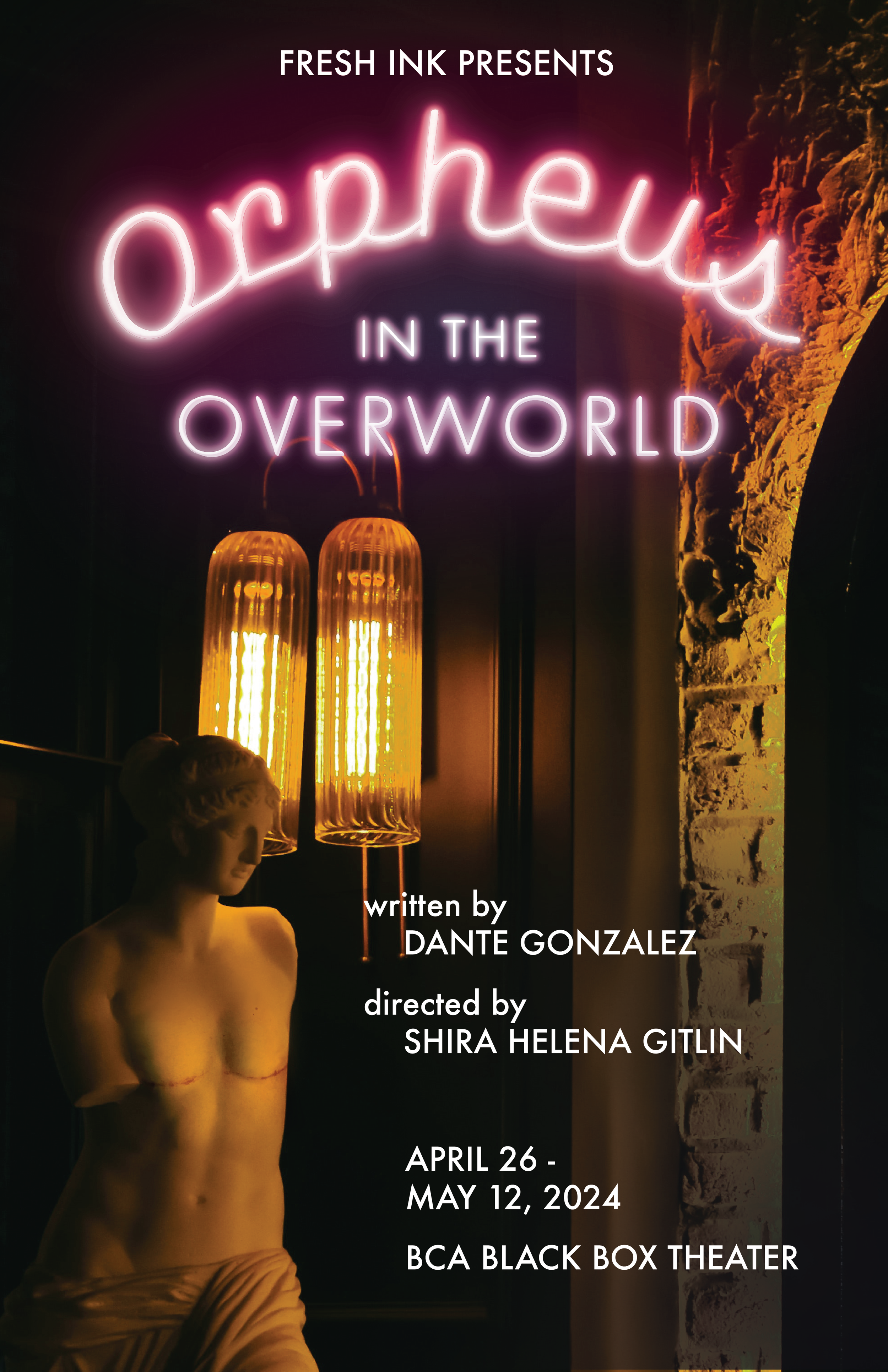
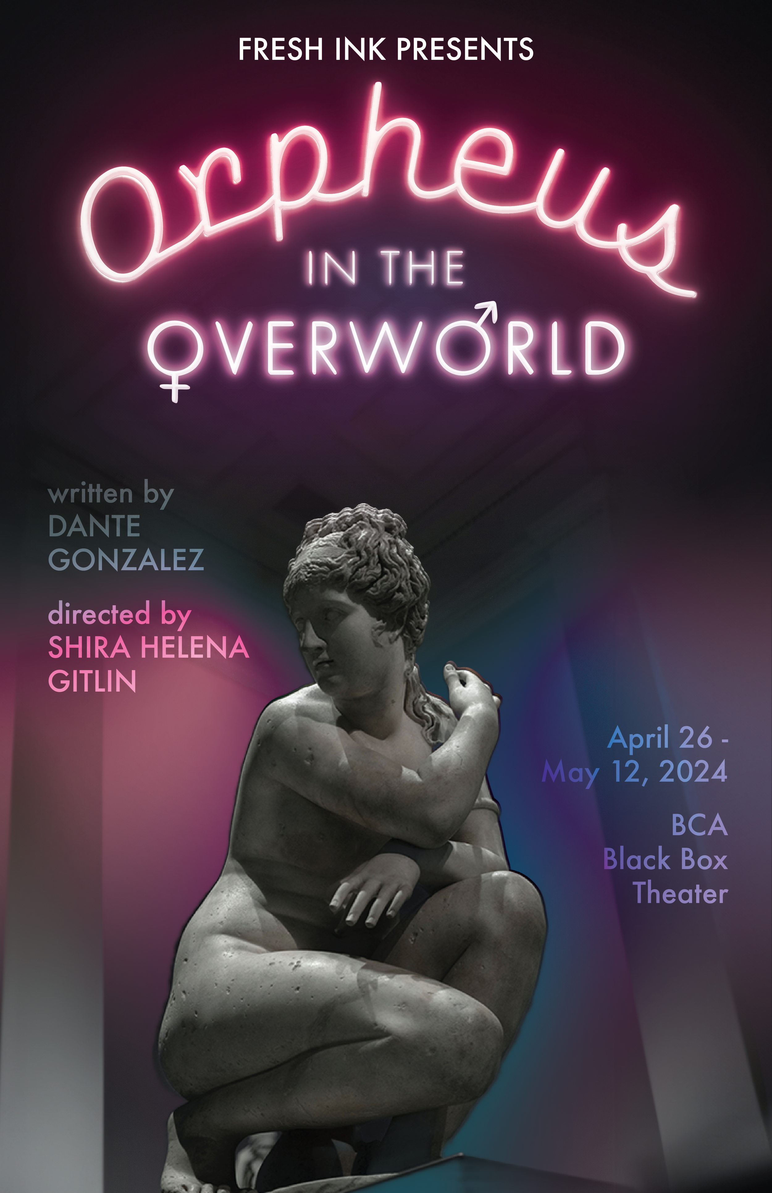
orpheus in the overworld

Orpheus in the Overworld was Fresh Ink’s most extensive workshop and biggest production during their 23-24 season. It’s a lush, extensive, gender and genre-bending retelling of the myth of Orpheus and Eurydice. In this version, Orpheus is transmasc, so I wanted to include elements of his identity in a way that was tasteful and not tokenizing. I went for an overall grungy, smoky theme (the play takes place in a grungy, smoky bar and notes a neon sign in its stage directions) and created gradient overlays in the colors of the trans flag, as well as adding hand-drawn top surgery scars to the figure in the stock photo I used. Given the scope of the production itself and the wide variety of print and digital assets, this poster required more resizing and reformatting than most of what I make for Fresh Ink.


process & other materials
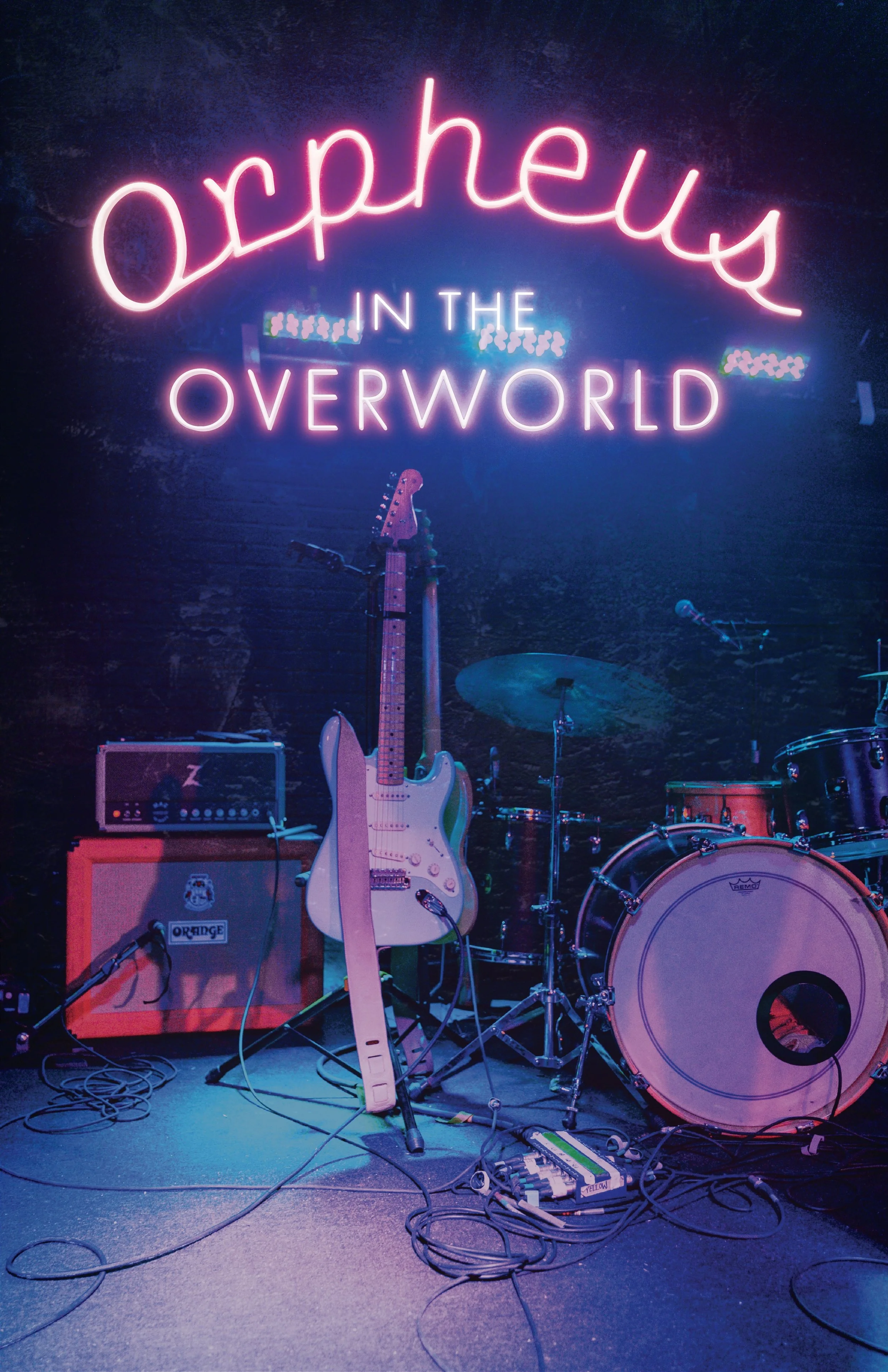
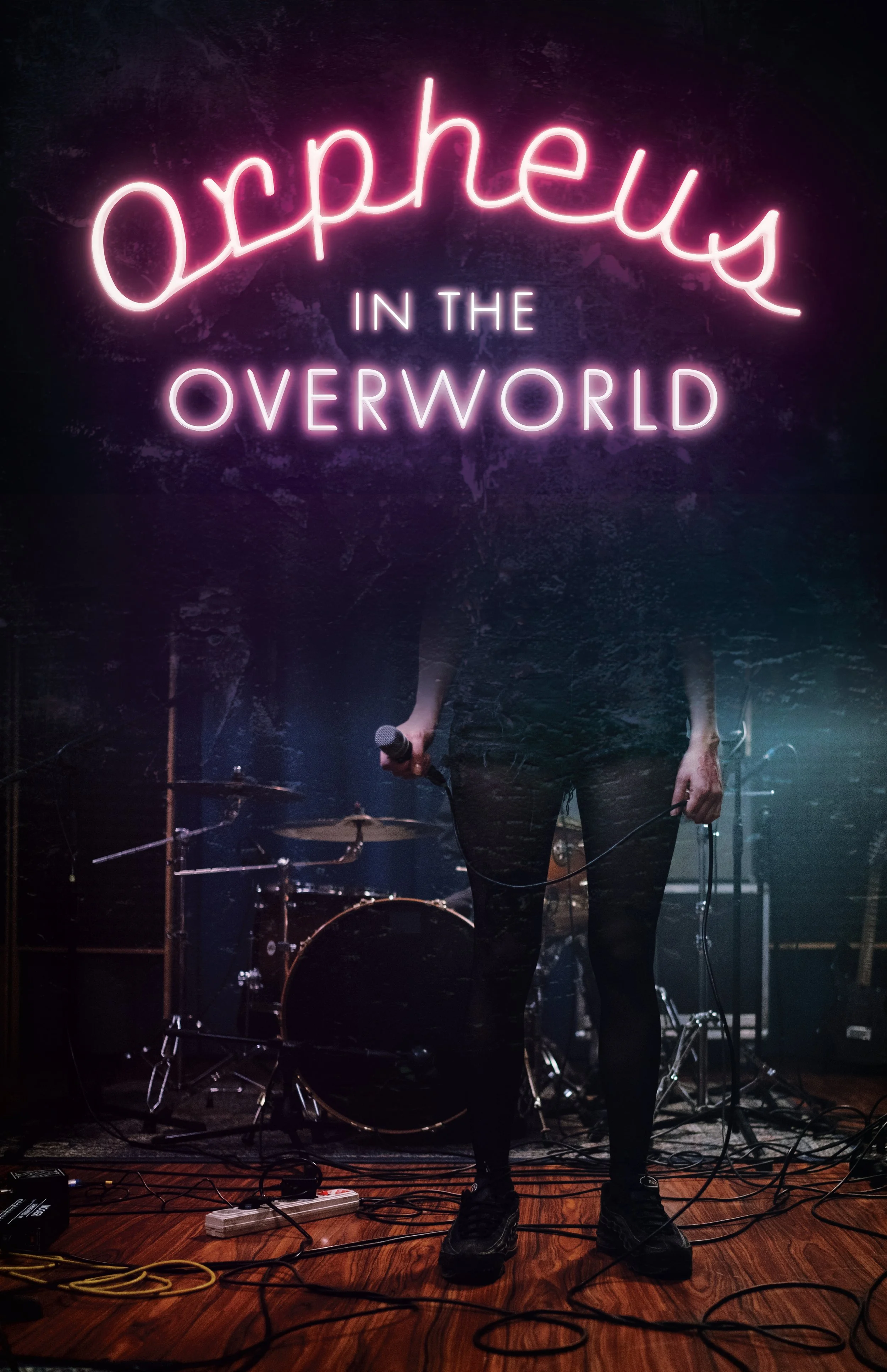
Some of my very early, very rough concept sketches. In this iteration of the myth, Orpheus and Eurydice are singer-songwriters, so I experimented with musical imagery in the early stages. Obviously, we ended up instead moving forward with the figure in smoke. It looks more striking and feels more specific.
Some second round explorations that go in a bit of a different direction. Given Orpheus’ exploration of his transmasc identity in this retelling, I thought it’d be interesting to experiment with photoshopping imagery of classical Greek statues to make them look more gender-neutral; I loved the dynamic pose of the black and white statue in particular, and the way it has its hands wrapped around its chest. Ultimately, the silhouette in smoke still won out.
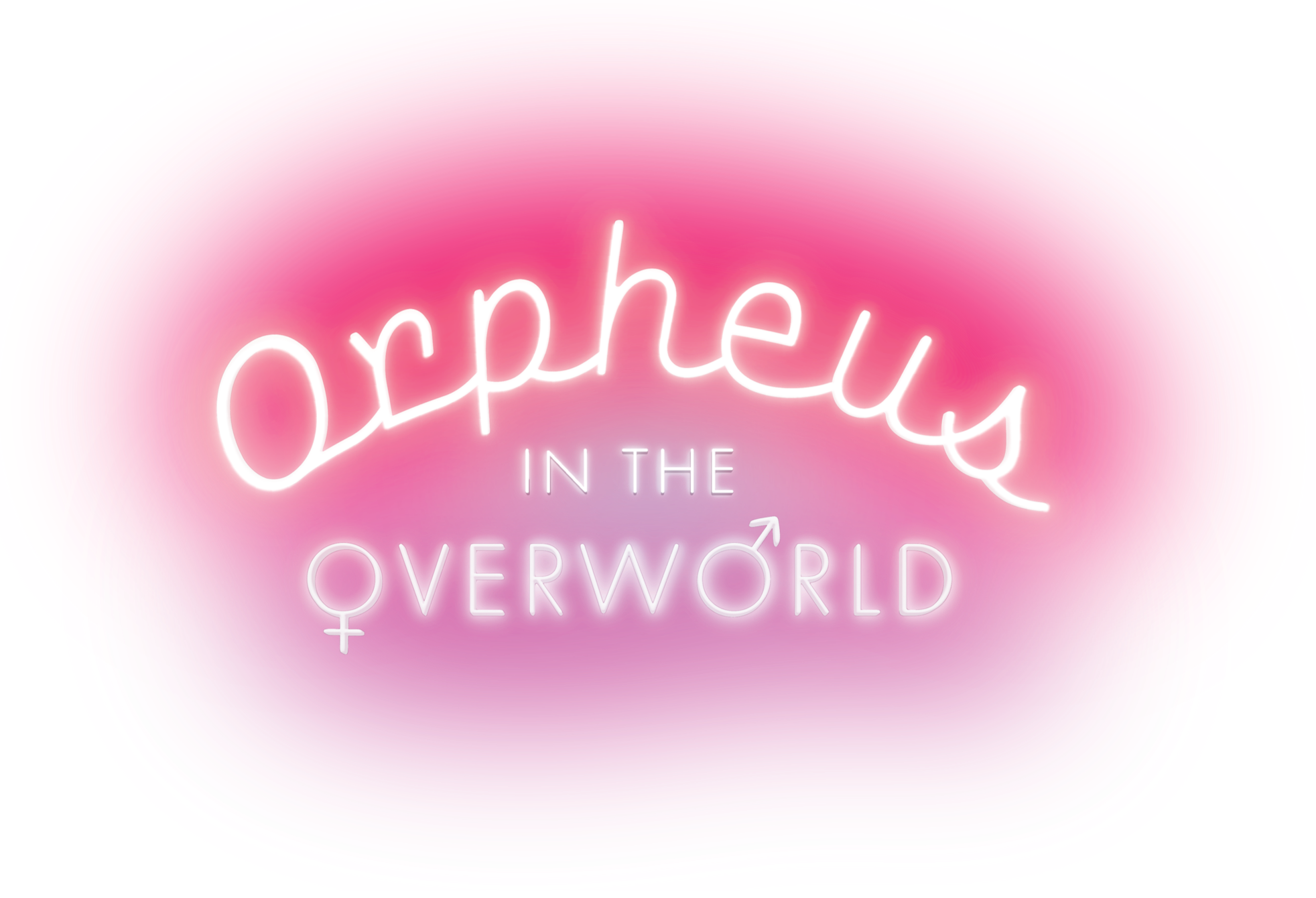
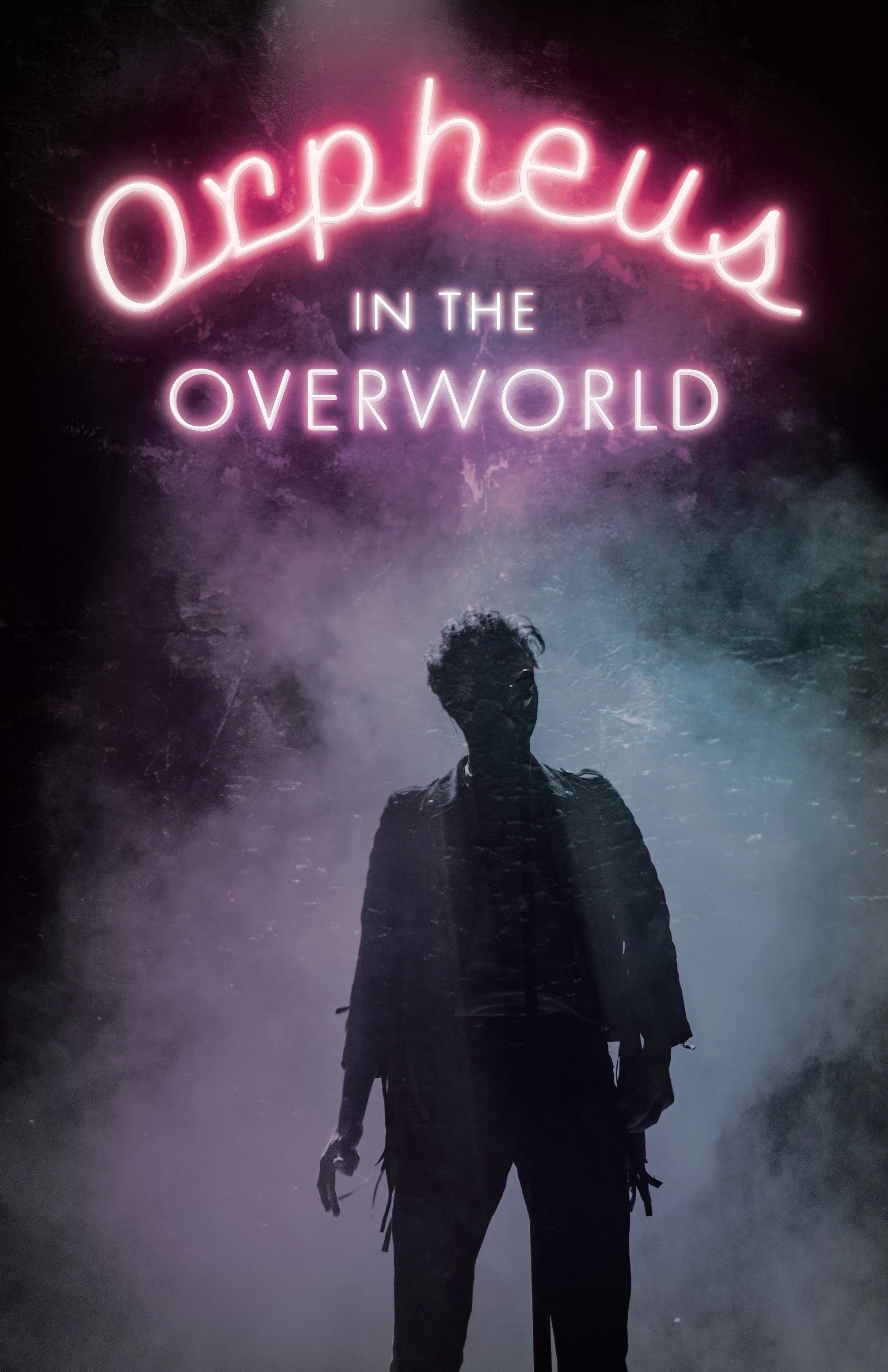
Final title lockup for Orpheus in the Overworld for the team to use on any other assets that needed it.
the more the man

The More The Man was the last poster I designed for Fresh Ink’s 23-24 season. Having created Honey Girl and Orpheus In The Overworld primarily with Photoshop and digital effects, I really wanted to experiment with making something illustrated entirely by hand, and felt that the rich, colorful setting of New Orleans was an excellent place to explore that. The play is centered around a young Black man named King. It focuses on his experience learning to understand himself in the context of where he grew up and navigating what matters to him in the present, and where he wants to end up in the future. I wanted to visually position King as a dreamer, with the city skyline and the setting sun illuminating the backdrop and adding depth and possibility to his world.


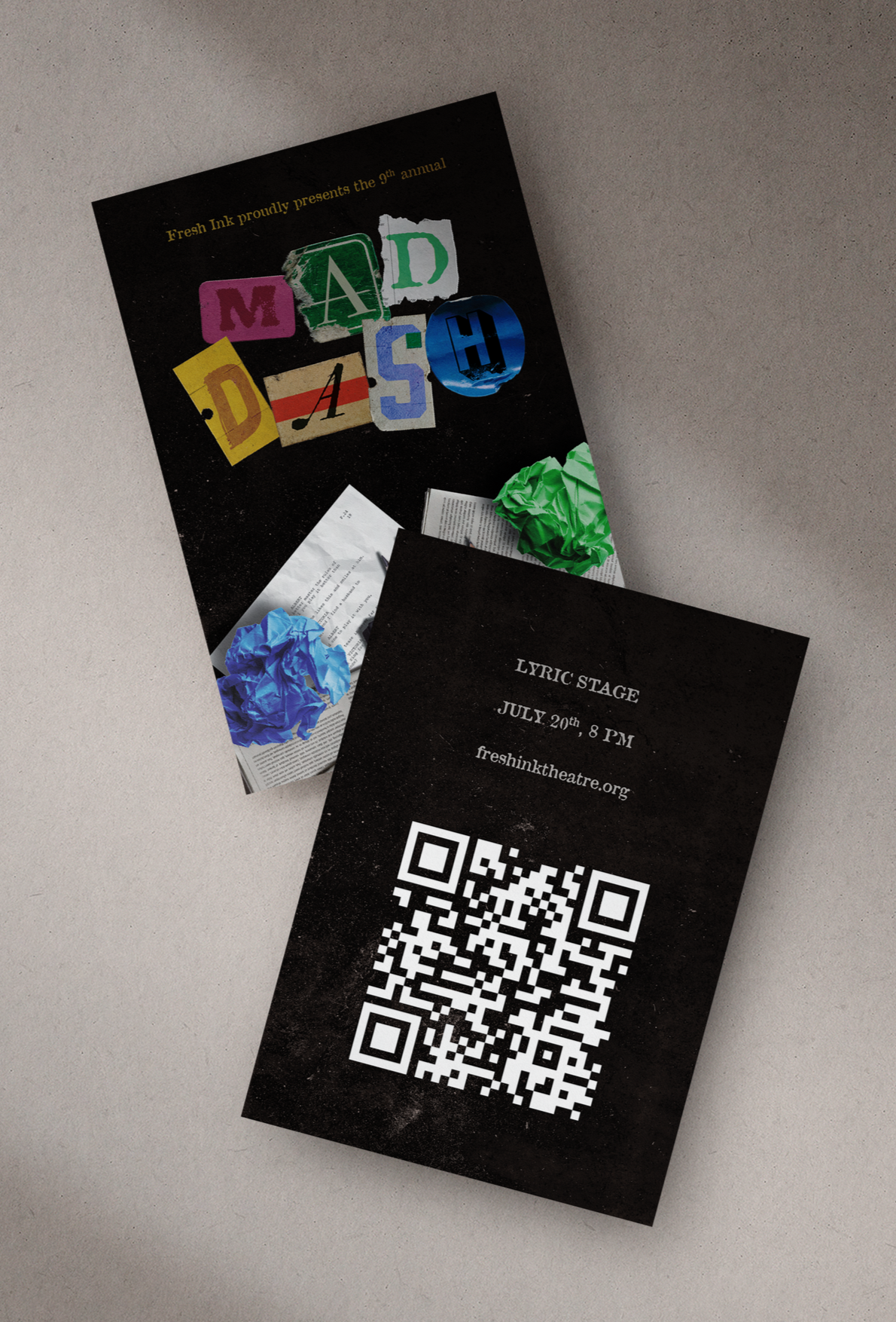
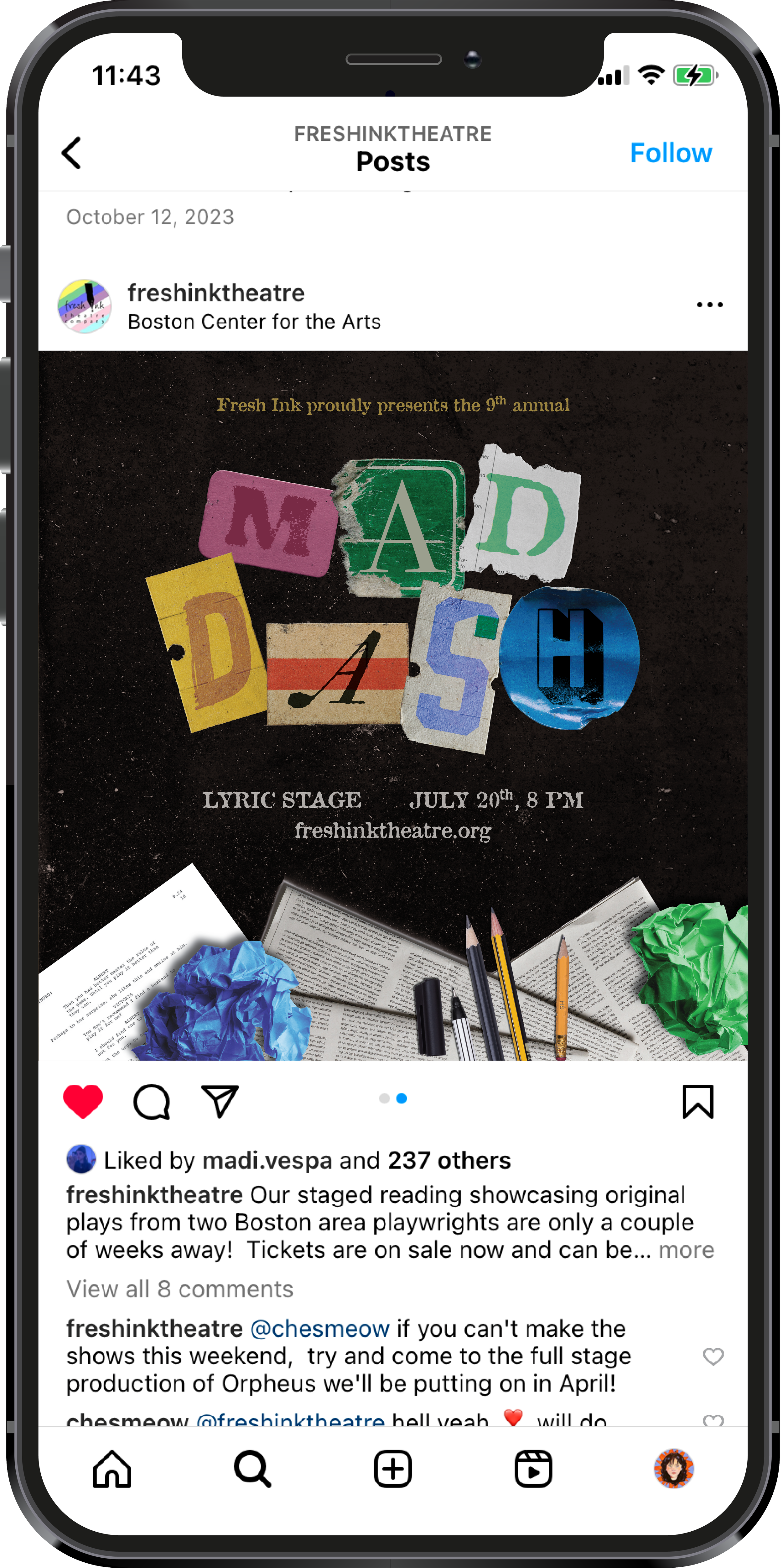
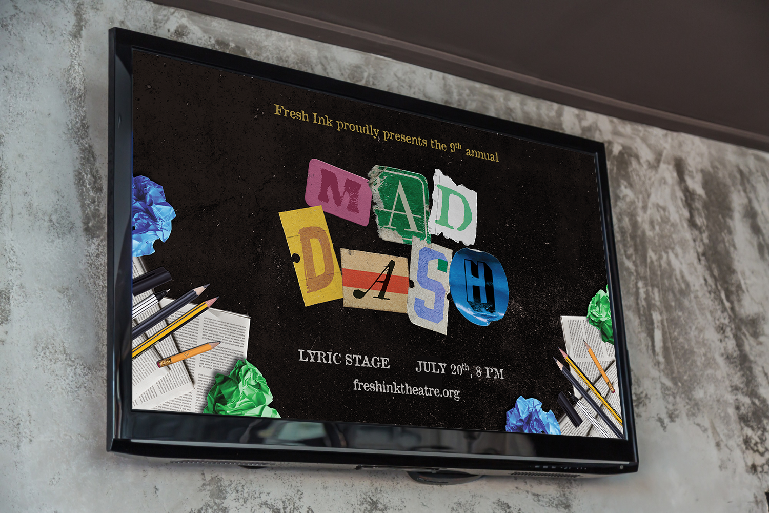
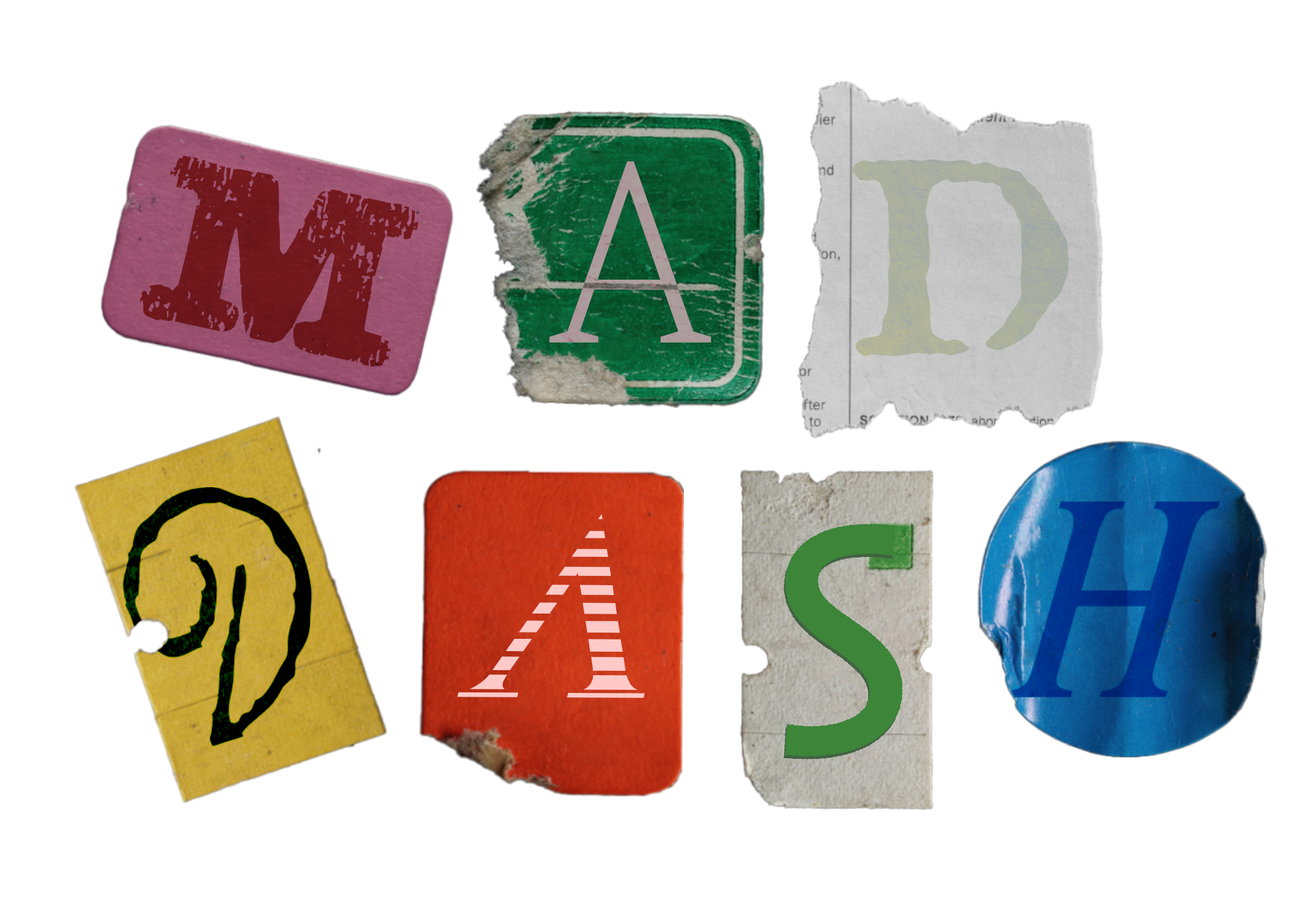
mad dash
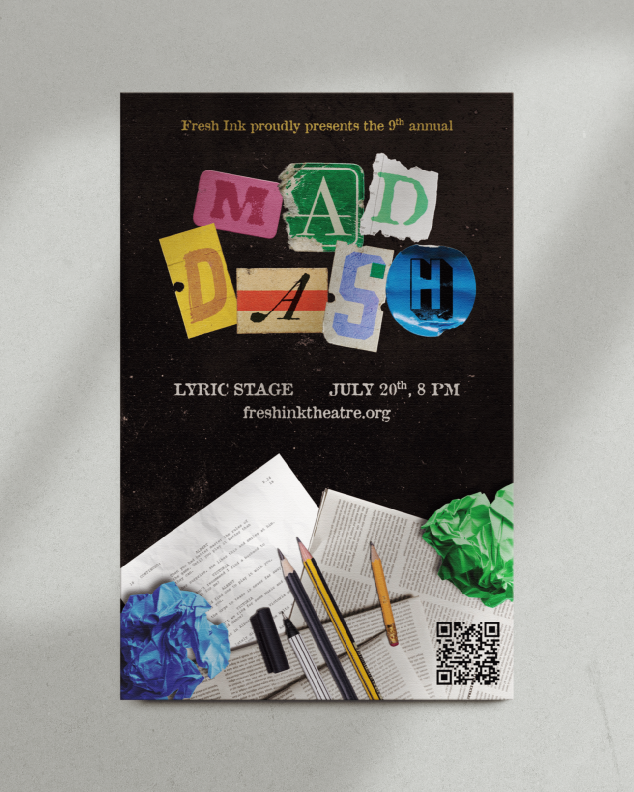
Fresh Ink’s annual Mad Dash is, as described on their website, a “wild and wacky celebration of new work that brings together the Boston theatre community to write, rehearse, and mount an evening of eight new plays in 24 hours.” I wanted to utilize a visual language for this poster that was true to the spirit of the event - fun, messy, and chaotic; an artistic hodge-podge. At its core, Mad Dash centers around people with different creative perspectives and styles coming together to make one cohesive piece, and that concept served as my ultimate guide throughout this design process.
process & other materials
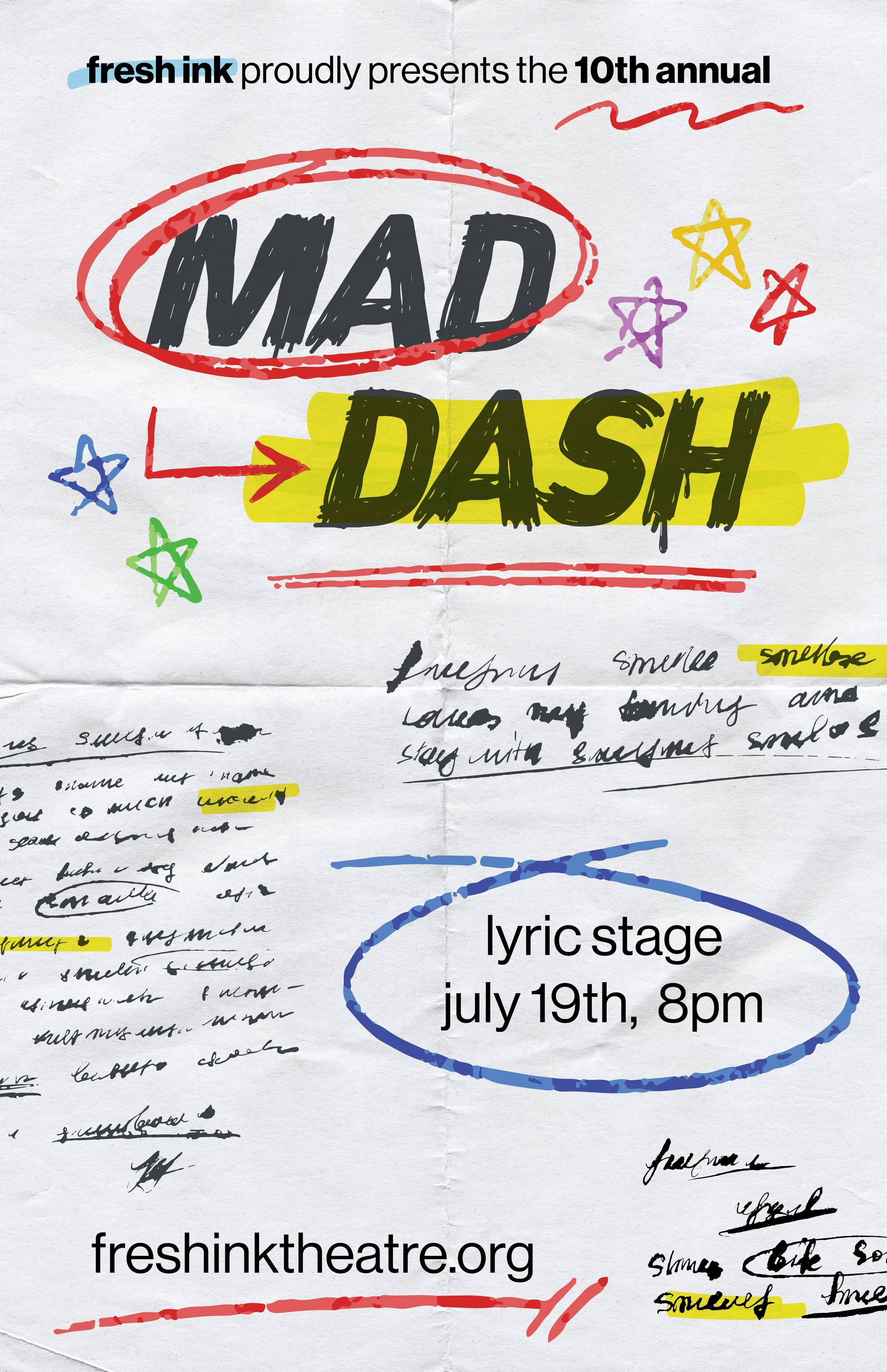
My Mad Dash poster design for the following year; essentially just another interpretation of the principles I followed the first time.
An early version of the 2024 title lockup. I ended up tweaking this for better typeface variation and legibility, as well as some of the blend modes to make the stickers look more realistic.
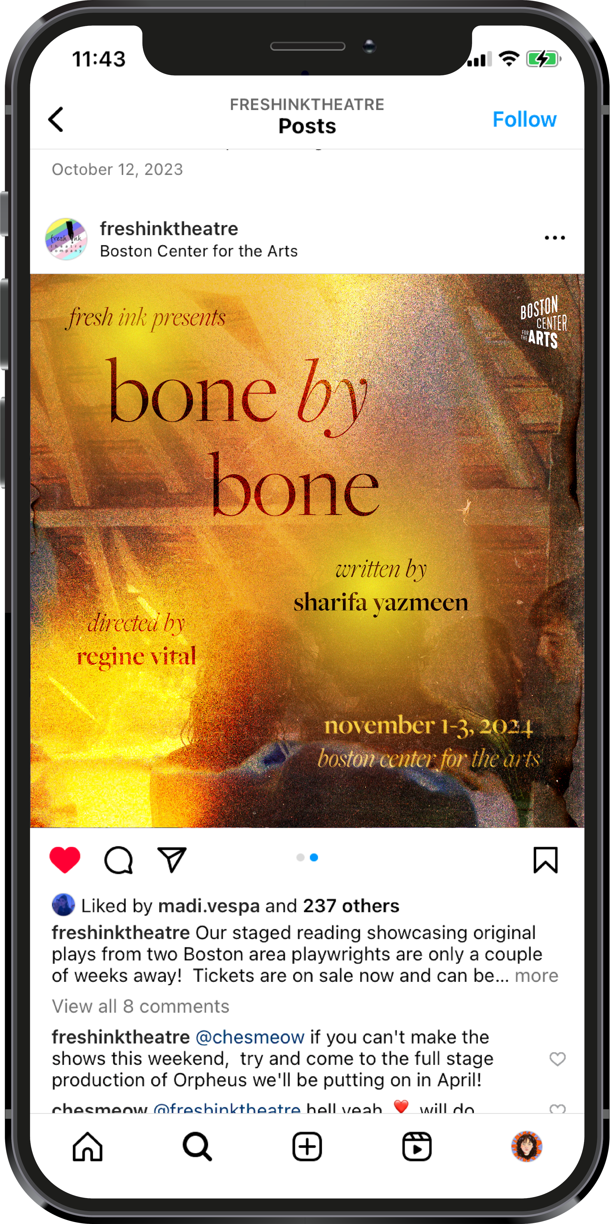
bone by bone
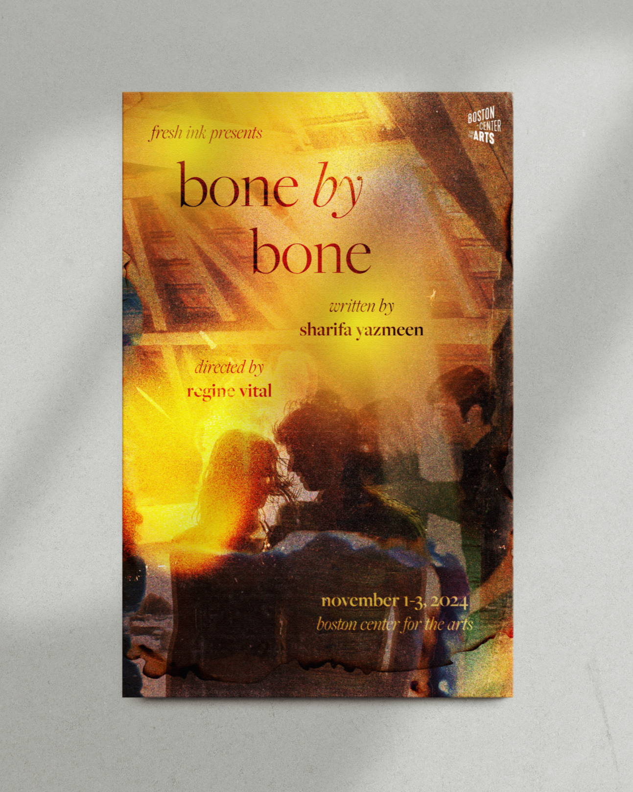
Bone by Bone is a tender, personal play about two couples stealing away in an abandoned attic. Their narratives take place twenty years apart, oscillating between each other and converging occasionally through letters, photographs, and parallel themes. This piece explores ideas of sex, shame, and how a place can be haunted by history, and culminates in a cycle being broken as the main character sets some of the attic’s old annals on fire. I was really drawn to the idea of imitating a double exposure effect for this poster, and because of that created a heavily layered image with lots of grain and varying blend modes. My favorite part of it is probably the lens flare - to me, it contemporaneously emulates the haze of intimate memory, heat, and flame.
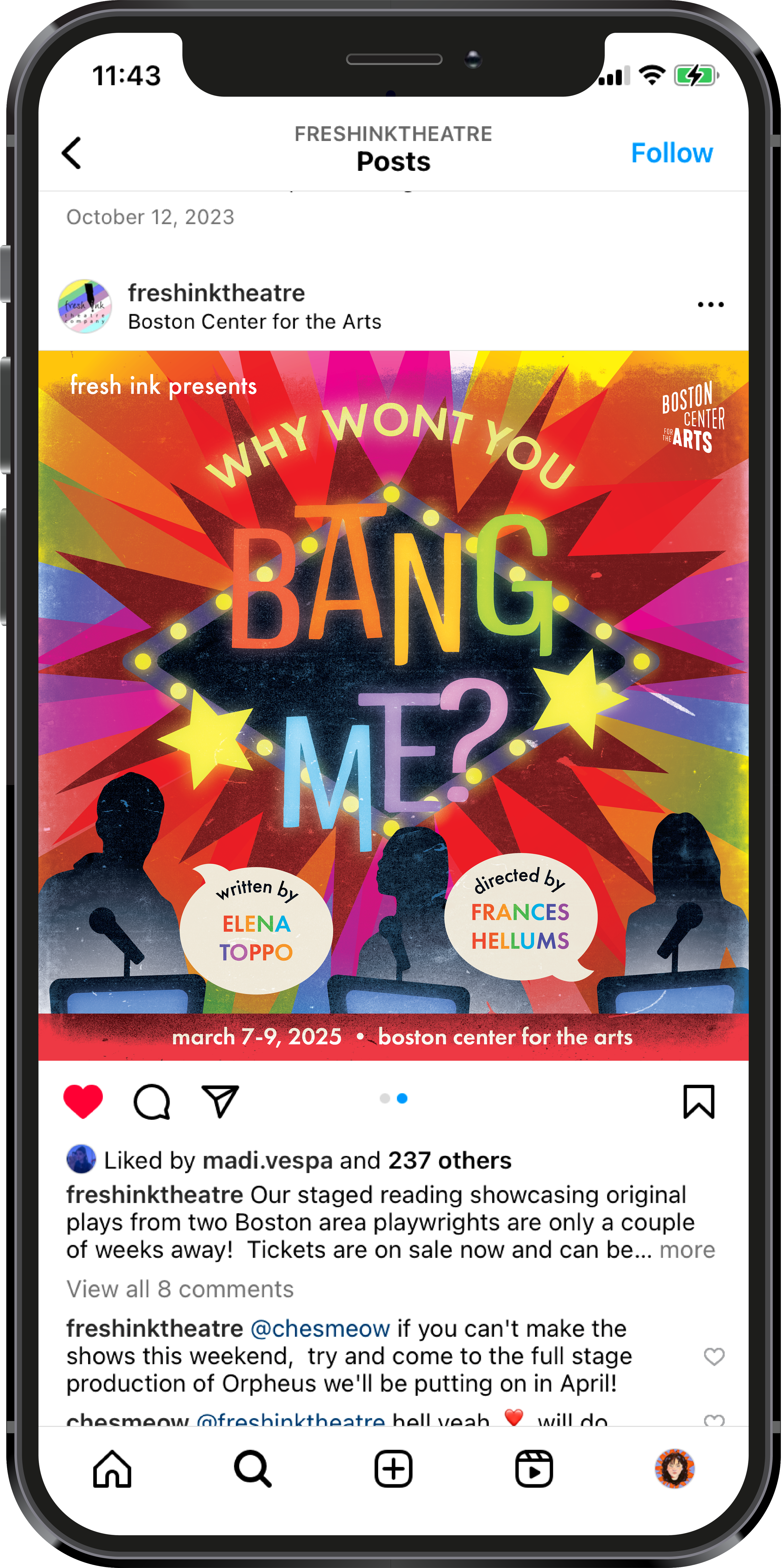
why won’t you bang me?
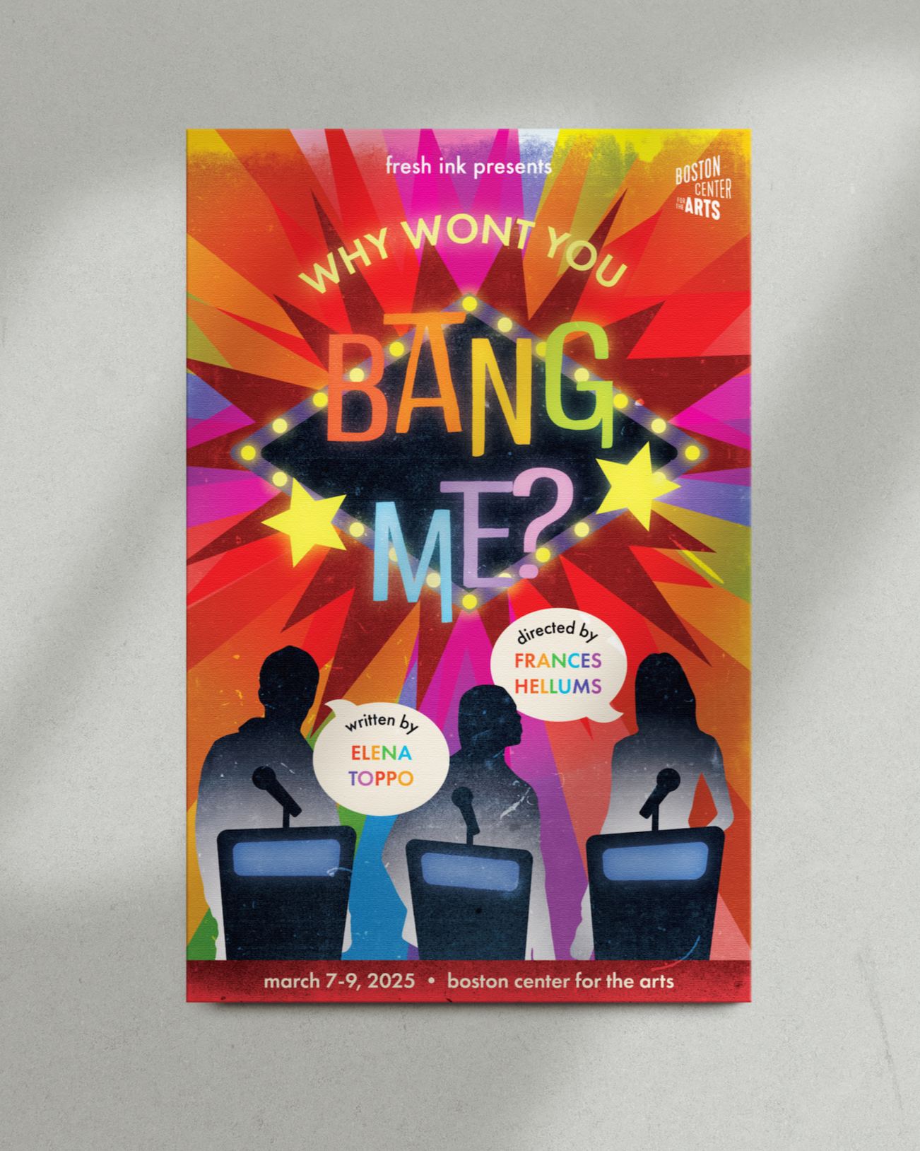
This play’s visual identity lives right in its name. Centering around an asexual standup comedian, this quirky comedy is peppered with interstitial scenes of an imaginary game show called “Why Won’t You Bang Me?” in which our lead character is interrogated by romantic exploits from their past, all asking the same titular question. Why Won’t You Bang Me is a joyous romp about friendship, more-than-friendship, and discovering one’s sexuality - or lack thereof. A fun, colorful game show title logo seemed like the best and most obvious direction for this piece. I leaned heavily on vector illustration and cartoonish imagery with this poster, adding some small gradient lighting effects and grain to give it a little more texture.
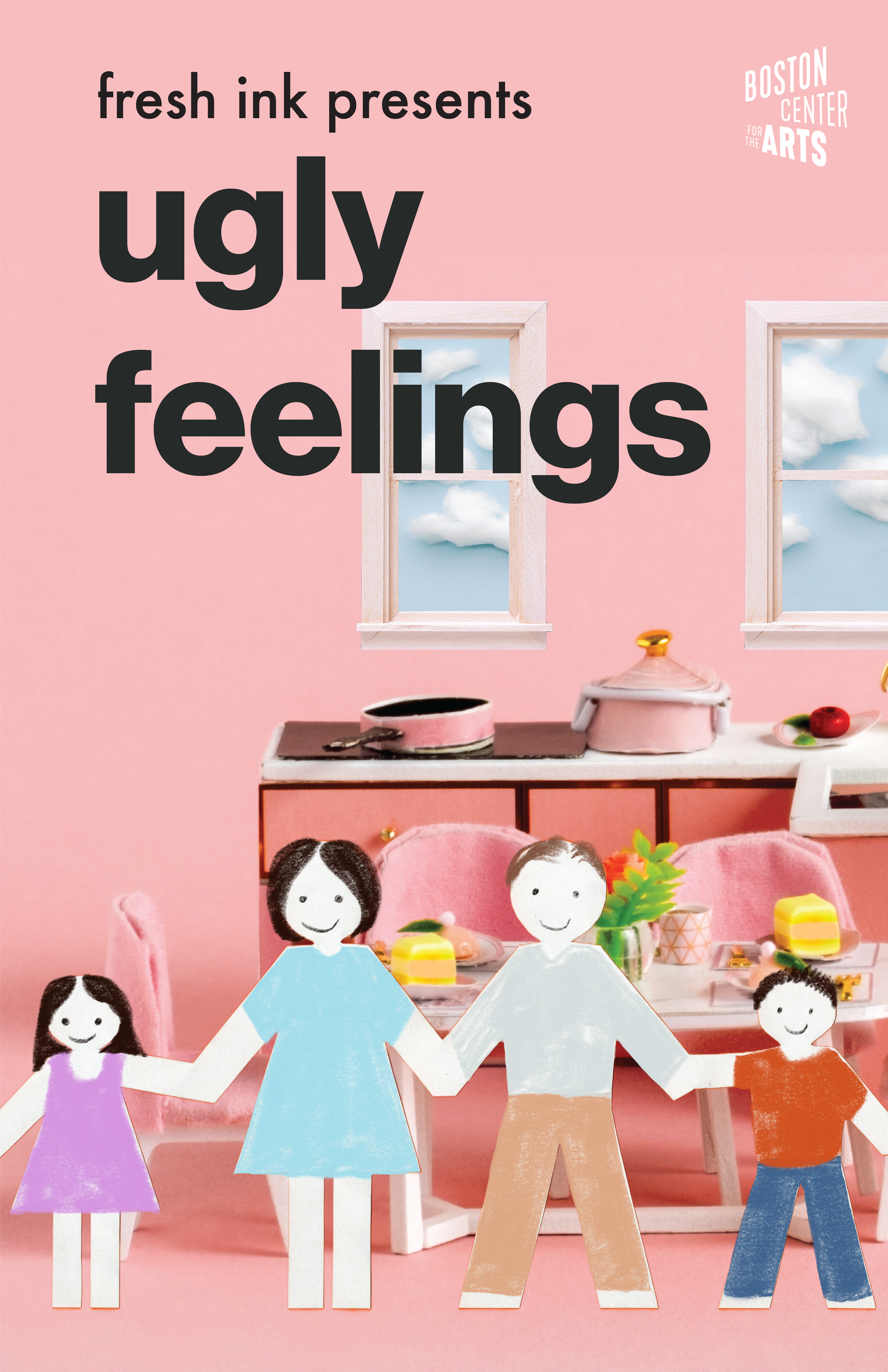
ugly feelings
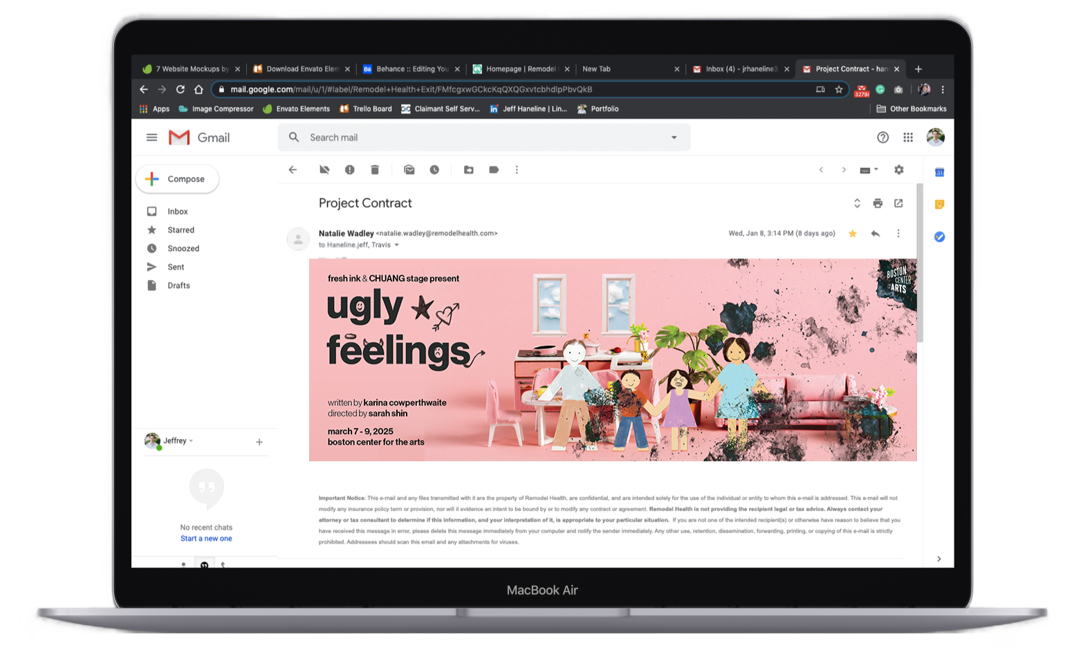
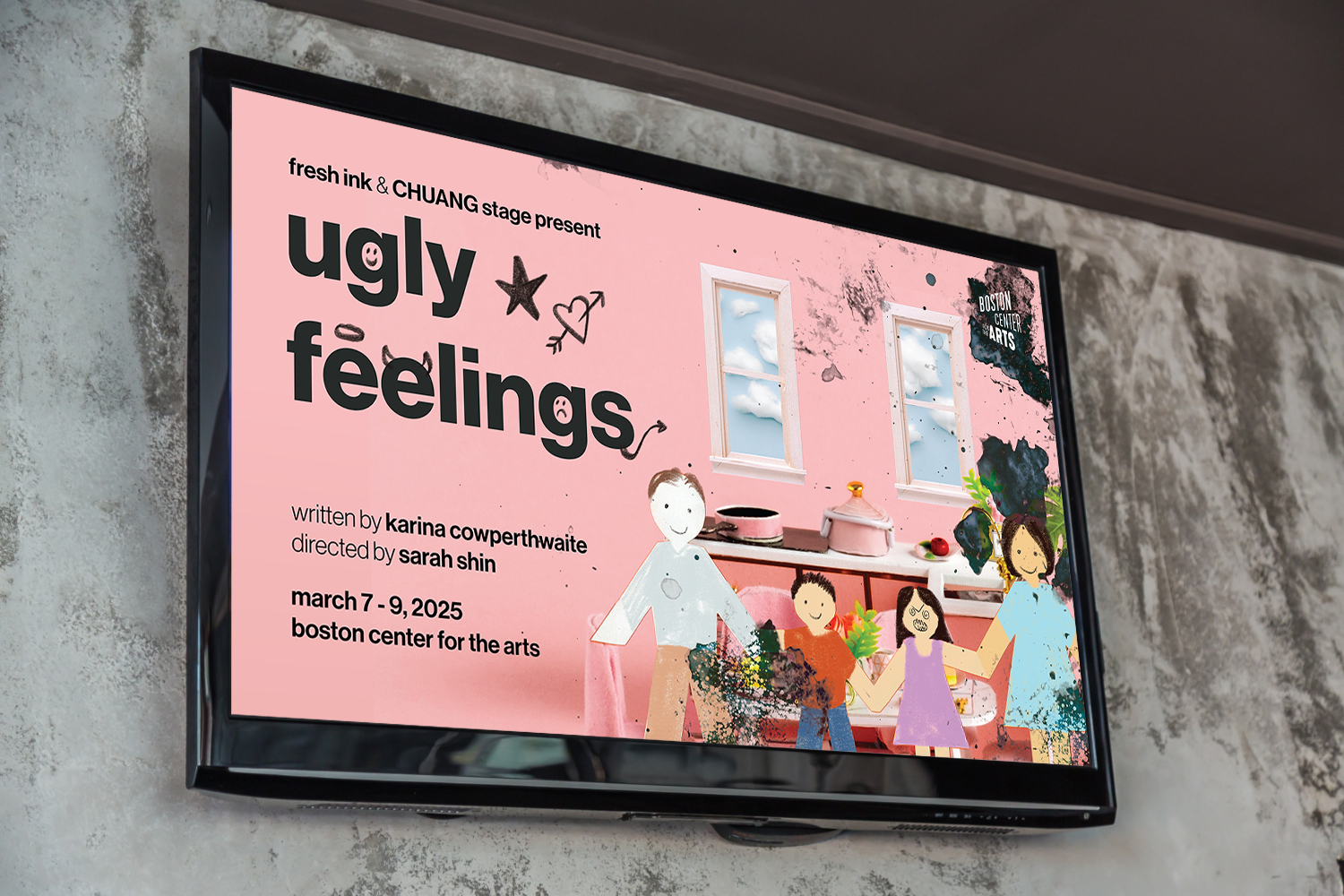
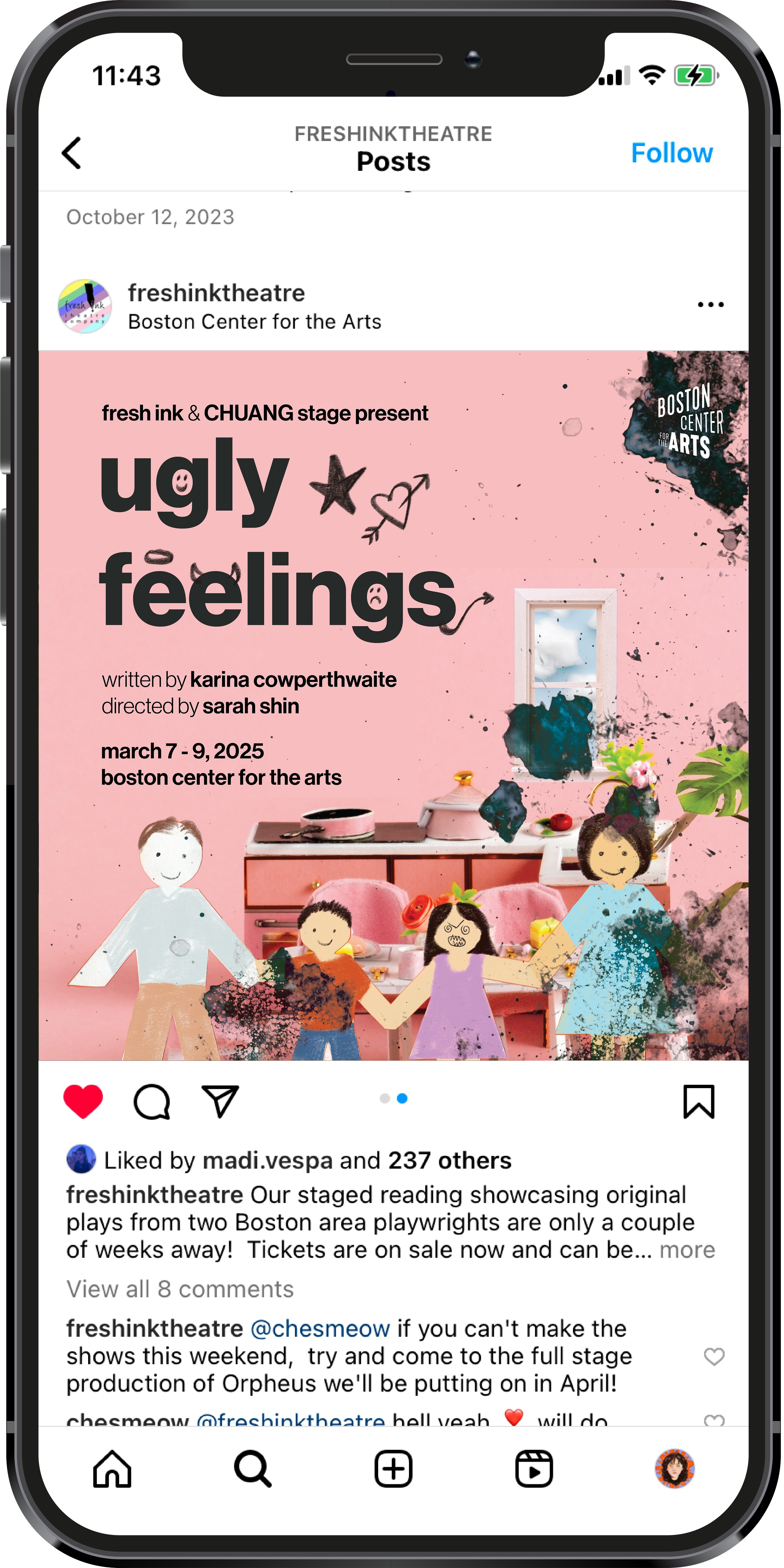
Ugly Feelings is a funky and fanciful piece about two Chinese-American twins navigating life in a primarily white suburb. Its setting description reads: “You press your greasy fingertips against the glass of a delicate fishbowl. Inside you see a little family of wooden dolls seated around a New England dining room. They live in a white picket fence suburb where the only restaurants to enjoy on a Saturday night are a vegan farm to table restaurant and a Chinese fusion restaurant with an item ambiguously labeled on the menu as ‘Asian Soup.’” This picture is so evocative that my first instinct was to render it exactly - but the fishbowl piece proved difficult to work with, and I couldn’t find wooden dolls that looked quite right, thus my new challenge became figuring out how to create imagery that’d evoke the same ideas. Through this came these paper dolls in an idyllic dollhouse kitchen. Their world is clean-cut and perfect, but that perfection is manufactured, and is interrupted with smudged ink and expressive doodles to emphasize the angst and cognitive dissonance that comes with figuring out one’s identity in a xenophobic world obsessed with conformity and categorization.
process & other materials
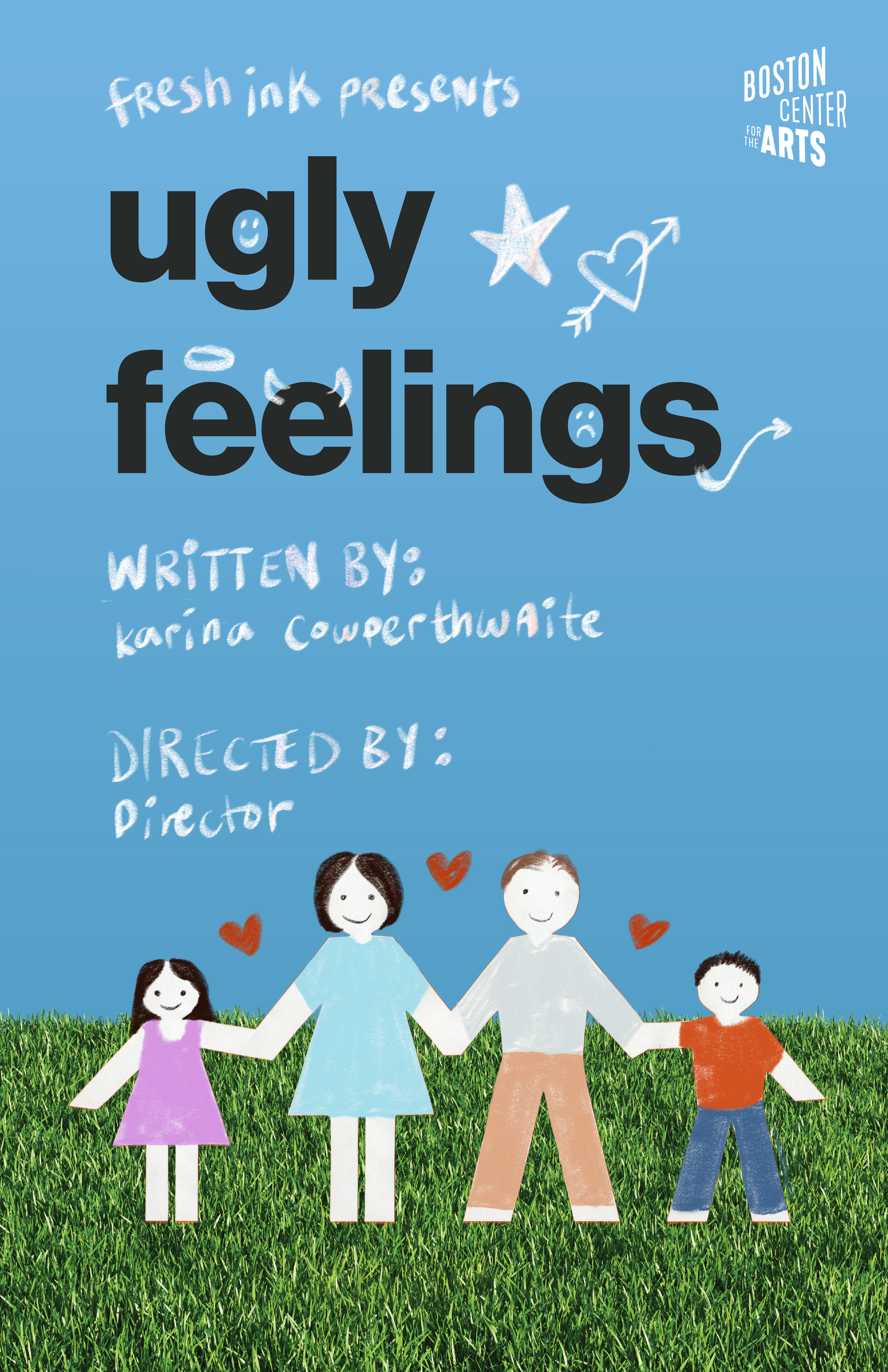
Two of Ugly Feelings’ first drafts. Funnily enough, initially I really preferred the sky/turf version - it felt a little cleaner and faker to me, like an early aughts Microsoft background. But the team liked the pink iteration better, so I had to focus my attention there and figure out how to incorporate what I liked about the other poster. I kept the rest of the text in that nice chunky san serif, but added back the pencil scribbles as well as some ink splotches on the edge to balance out that heavy black title a little more. I also got some great edits from the Fresh Ink team in between these versions and the ones above, like changing the tone of the paper on each doll and putting the kids in the center, since the story is really about them. And, on that note - I added one final detail of changing the main character Jenny’s face. Even though the play highlights both her and her brother, she is the narrator and the only one to break the fourth wall.
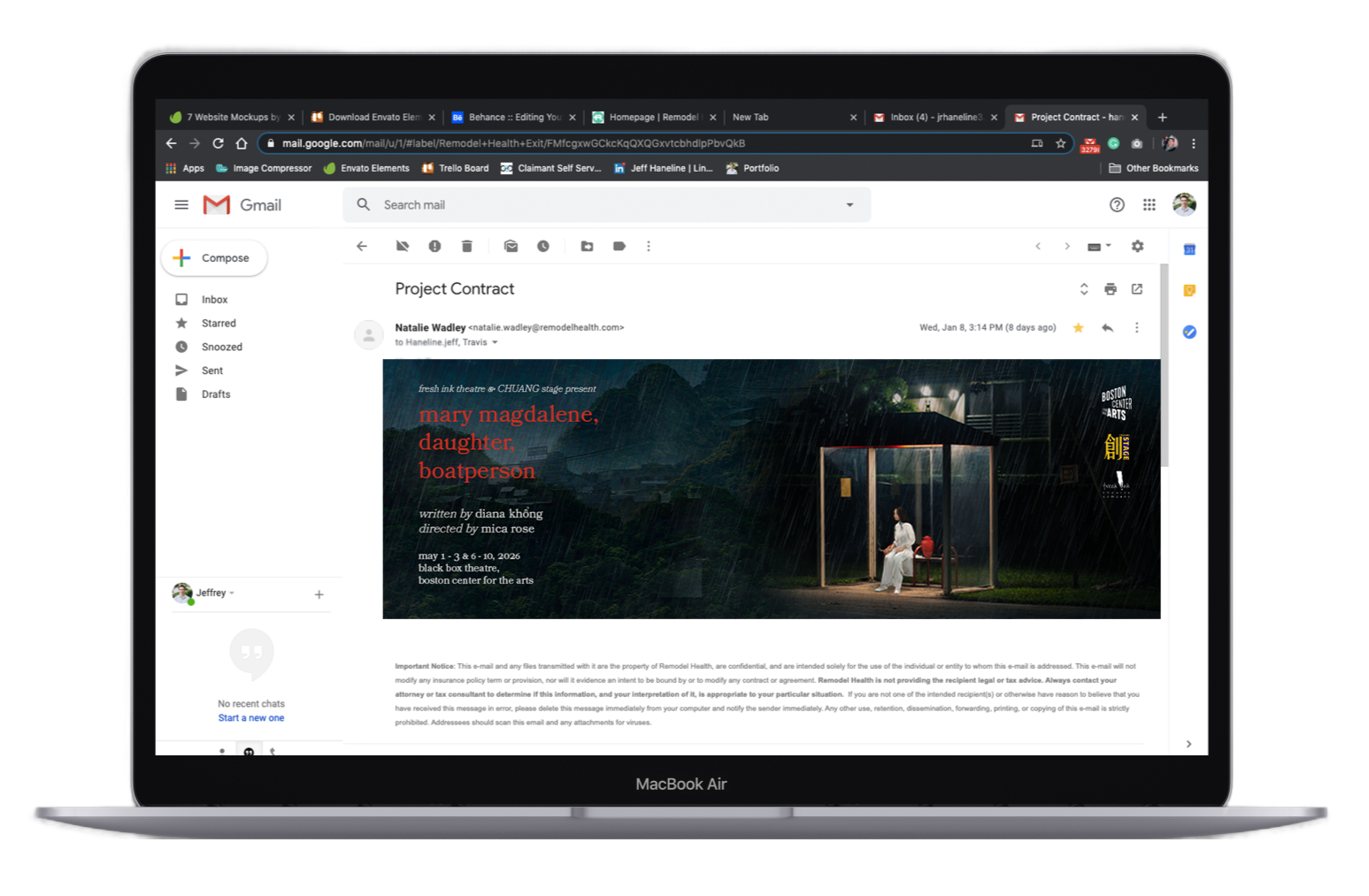
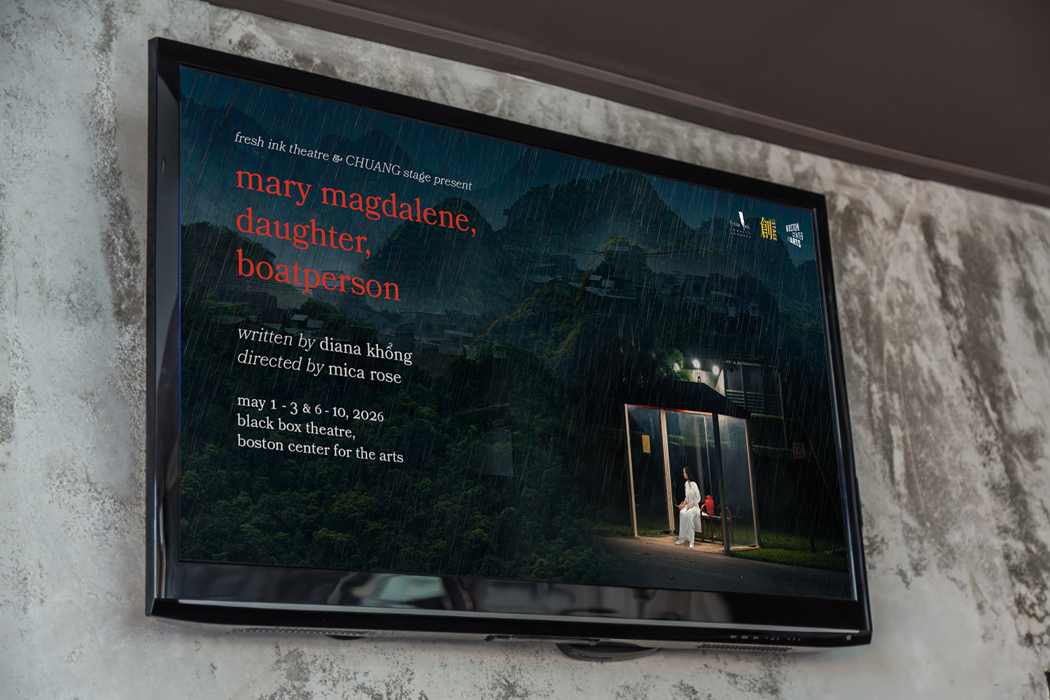
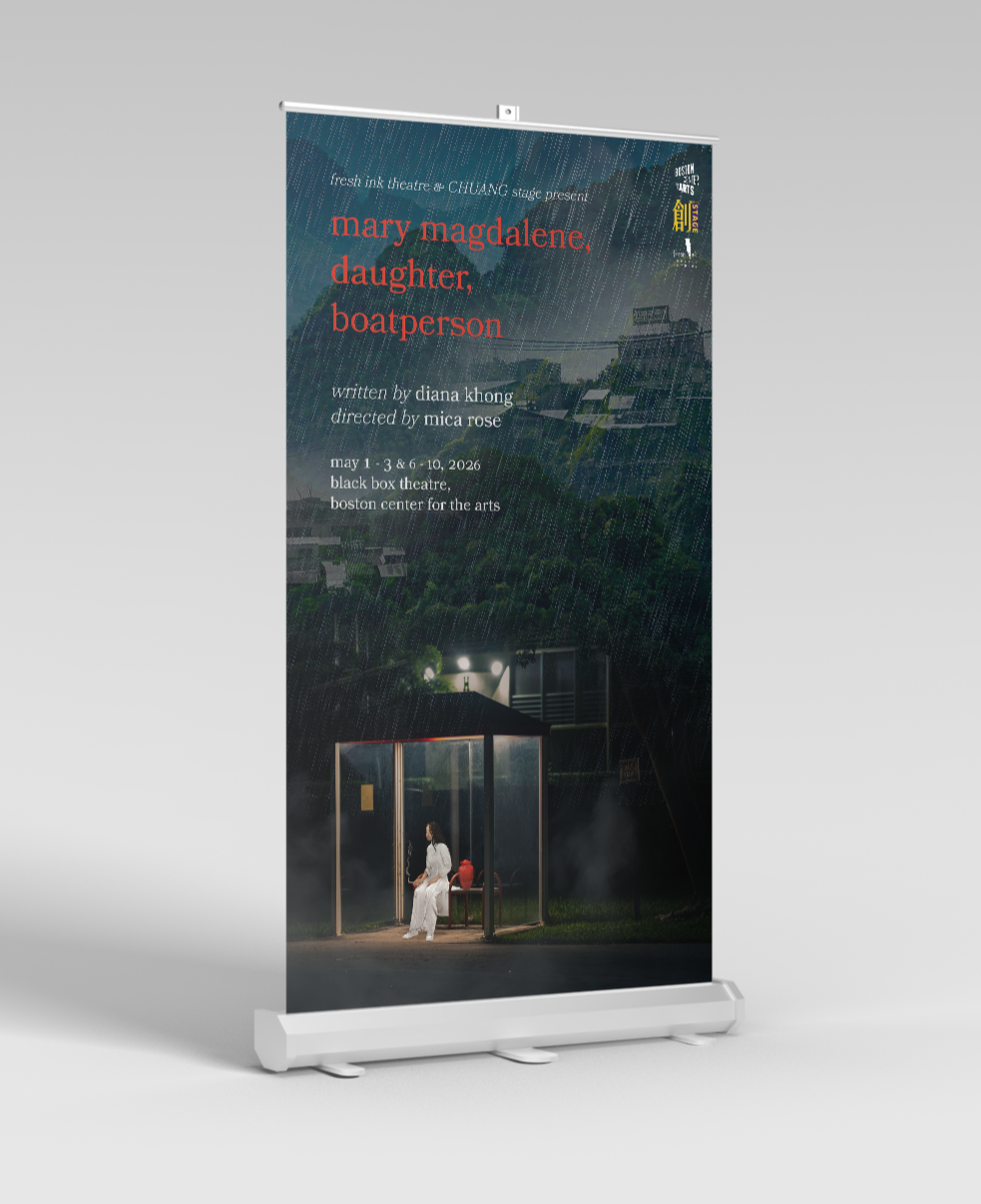
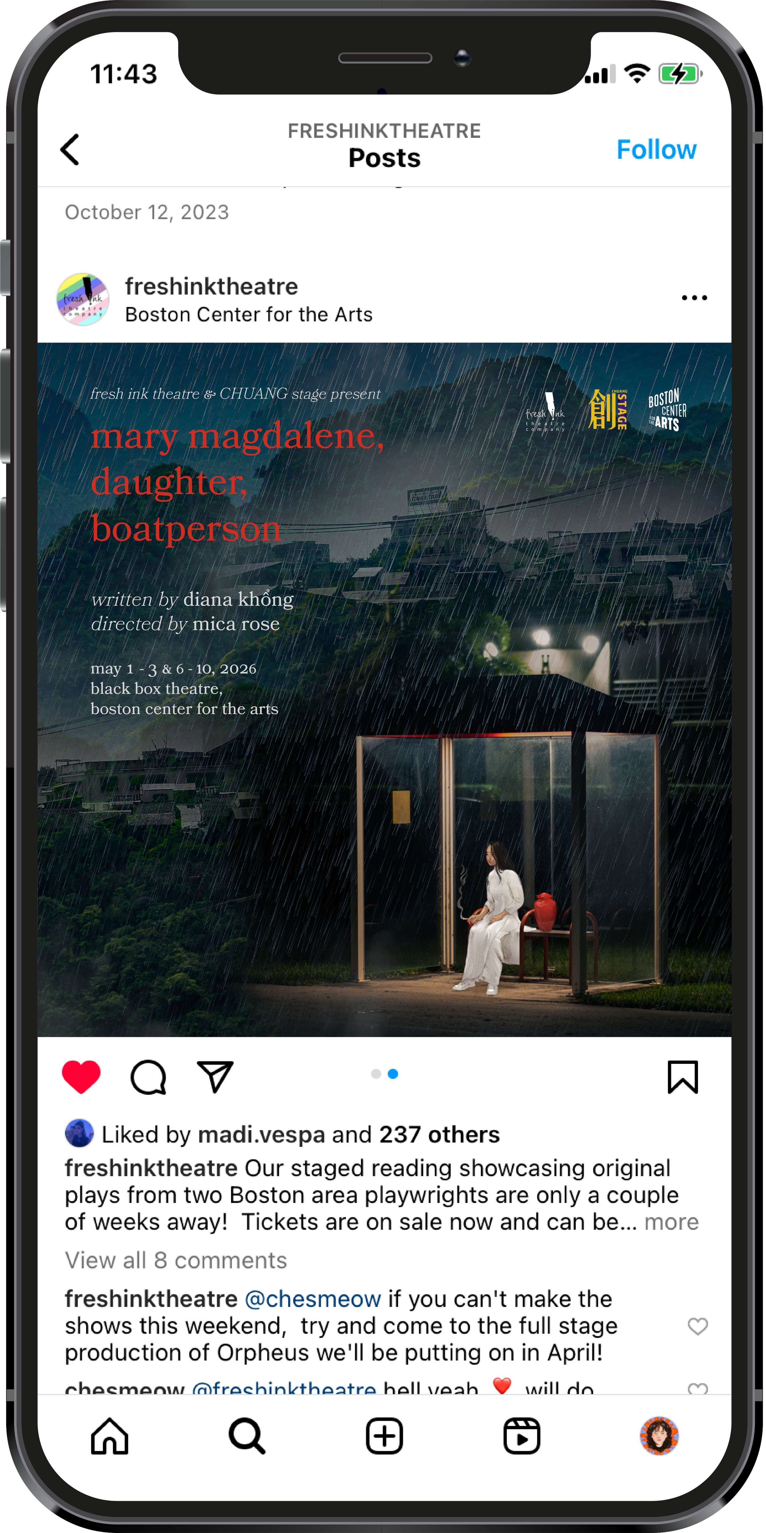
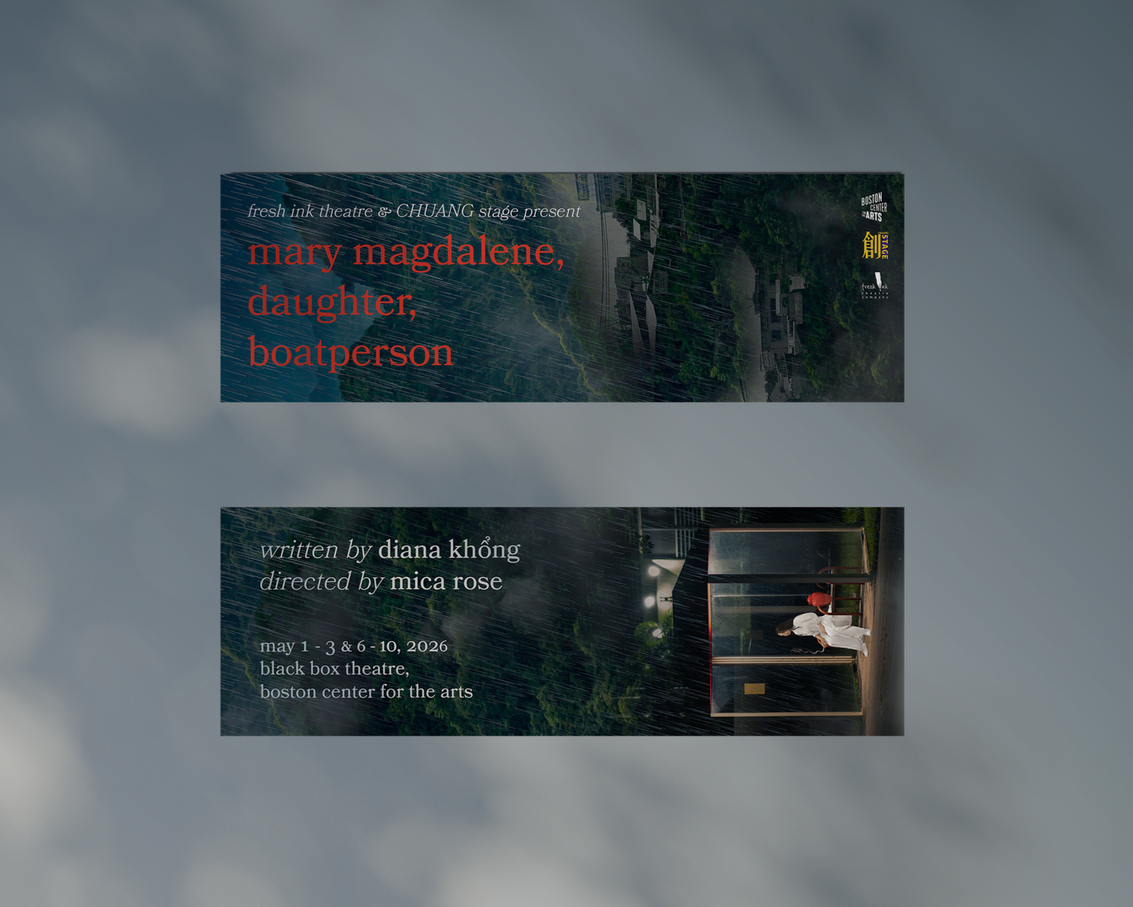
mary magdalene,
daughter, boatperson
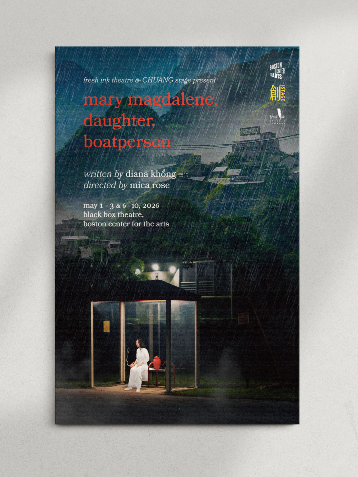
Mary Magdalene, Daughter, Boatperson is about generational trauma and grief. It centers around a trio of first generation Vietnamese siblings who have just lost their mother, and the complicated relationships they have with her, each other, and ultimately themselves. The opening imagery of the play is of the middle sister, Joy, sitting alone at a rainy bus stop with her mother’s ashes in a red urn. I loved the idea of taking that snapshot and expanding it, making Joy look small against a vast backdrop of Vietnamese mountains, everything smothered in rain. The play has a bit of a surrealist tone at times and spans two generations, one in 1970s Vietnam and one in a modern day US city. I wanted to emphasize this intertwining span of time and space by overlaying multiple landscapes on top of each other, hence the skyline nestled into the mountains.
process & other materials
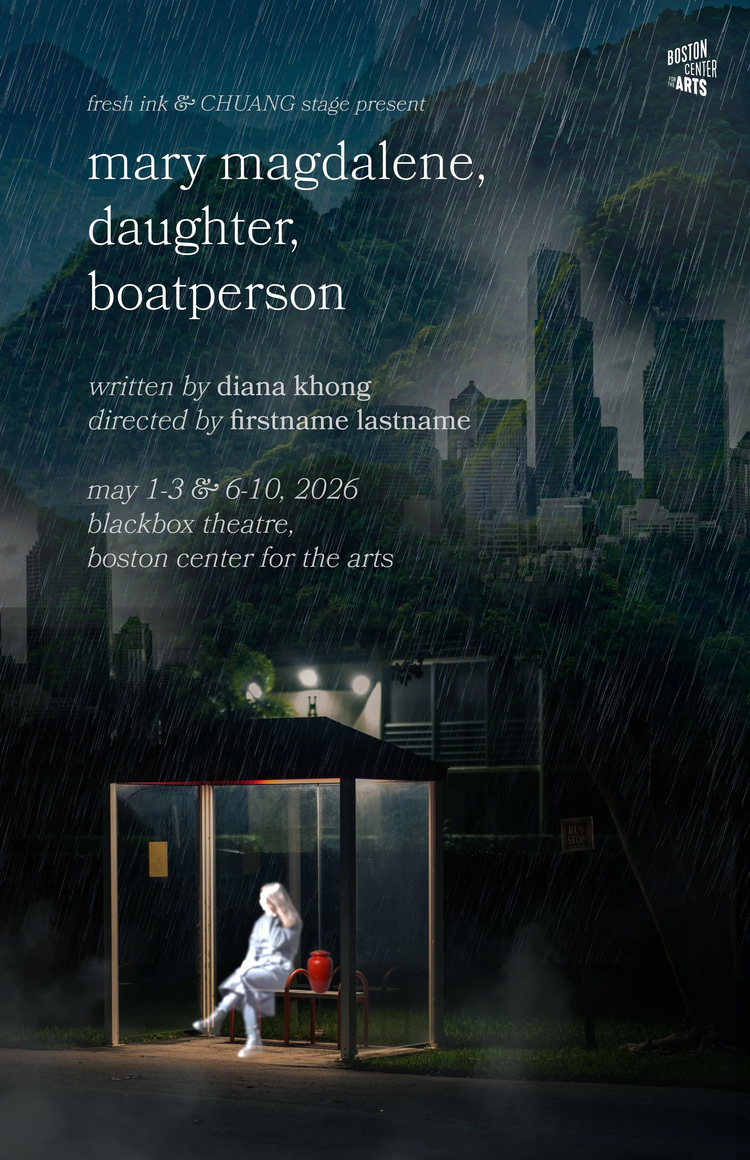
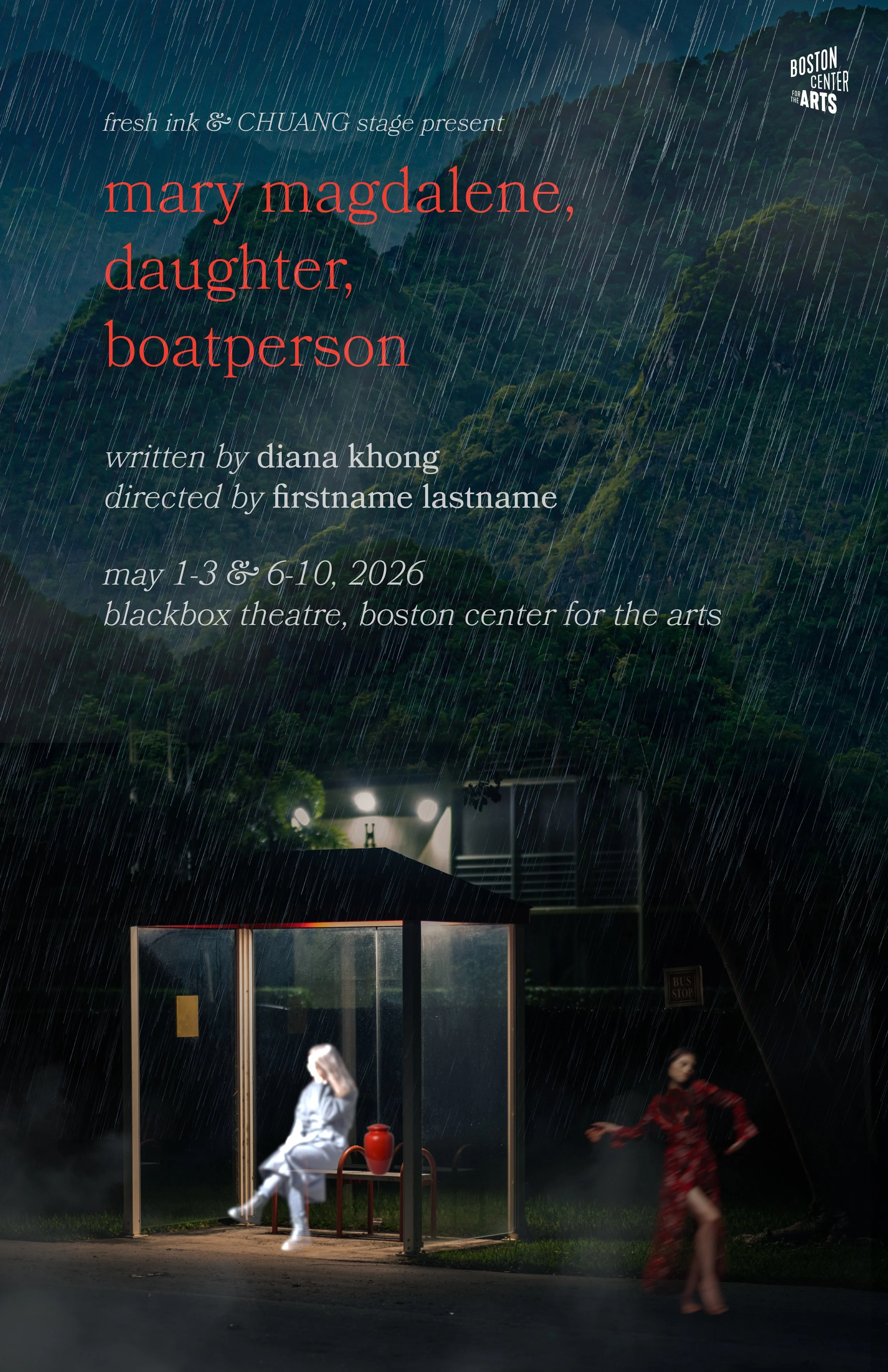
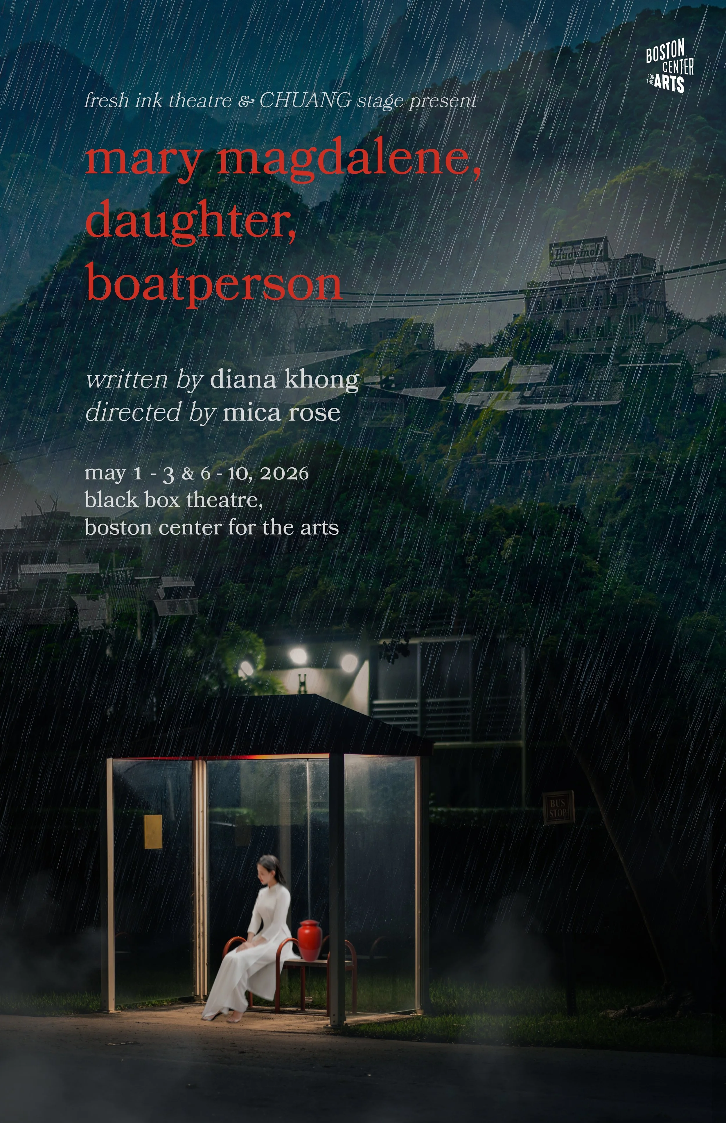
My first few drafts of Mary Magdalene, Daughter, Boatperson. I experimented with both red and white title text - Fresh Ink preferred the red, so I gave the text a slightly heavier weight in later versions for better legibility. The city skyline in the backdrop was initially representative of the US city that the three siblings reside in, with the mountains as contrast - but the team requested I find skyline imagery of 1970s Vietnam, for more specificity.
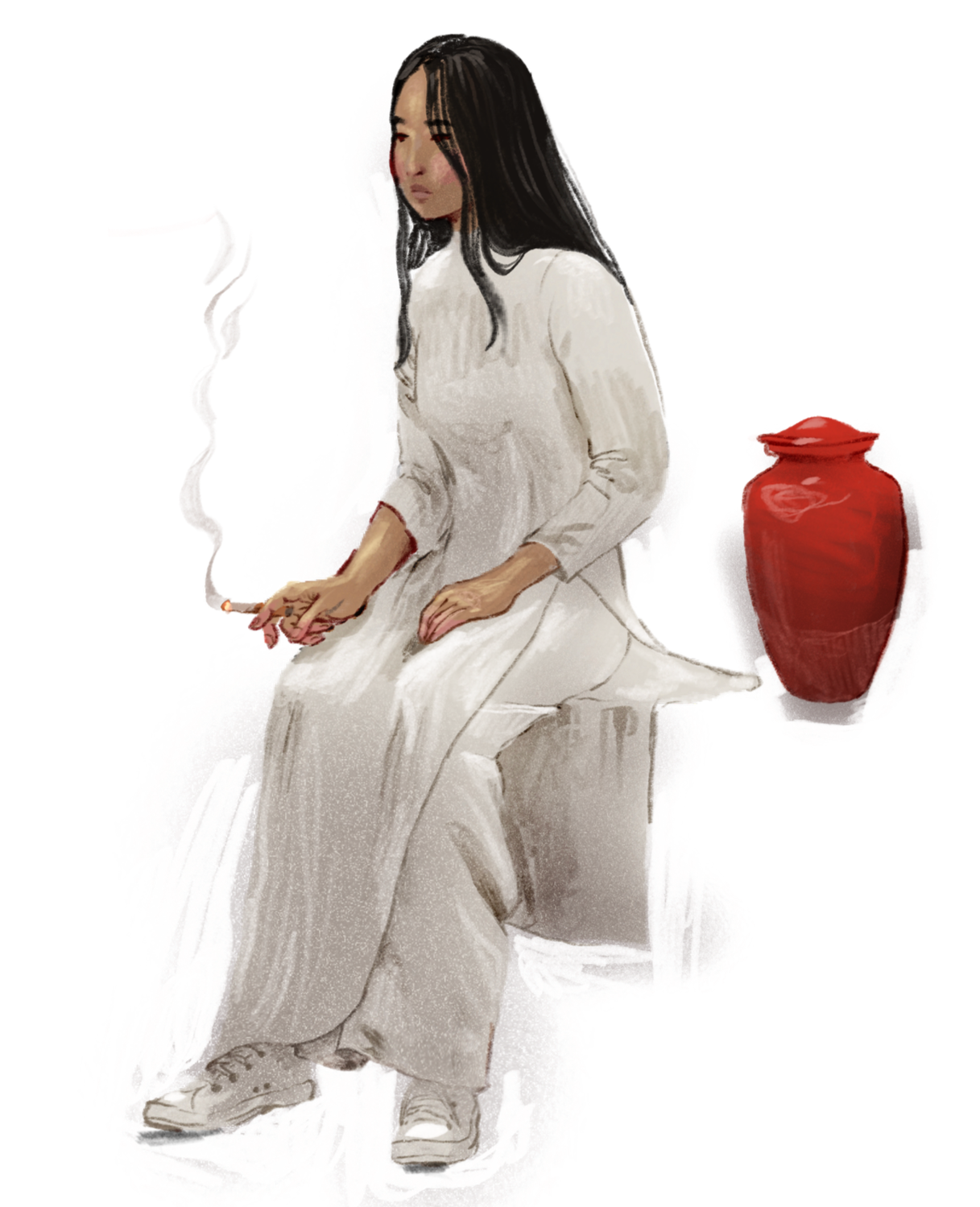
I cycled through a number of potential stock images to represent Joy at the bus stop. The playwright requested I find an image of someone wearing a white áo dài, traditional Vietnamese funerary wear, but didn’t like how posed and put-together the figure looked and asked me to hand illustrate a version instead. Thus, we have this final version of Joy - close-toed shoes for the rain and cigarette in hand, with the composure (or lack thereof) of a young woman who’s mom just died AND who just missed her bus.